
The Dog Treats Project
This project specifically was a personal favorite of mine since it touched on the topics of puppy love and colorful illustrations. We were assigned to make a dieline package of our own pretend brand of either pasta or dog treats, and I took my time to dedicate this project to my dear companion, Joy. This is all my progress on how I made it happen.


Moodboard created for inspiration. I wanted my packaging to be warm and friendly, but convincing enough so that anyone can buy it. You can easily tell with the fall like colors blending in with cheerful images of animals.

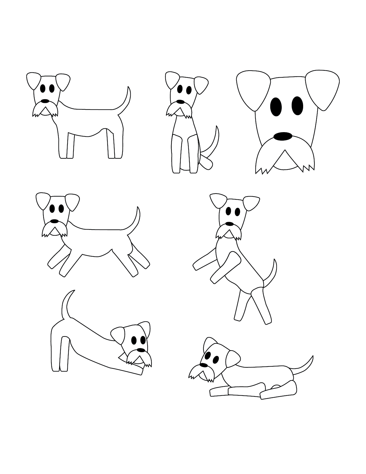
Sketches that contains miniature schnauzers as well as possible logomarks. There were also different poses being used for different scenarios of the packaging.
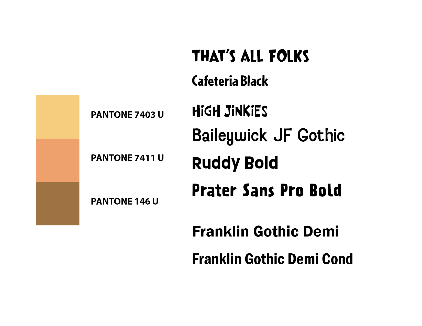
I had to use only three Pantone colors as a challenge. This also had the typefaces I tried before settling on Ruddy Bold and Franklin Gothic Demi.
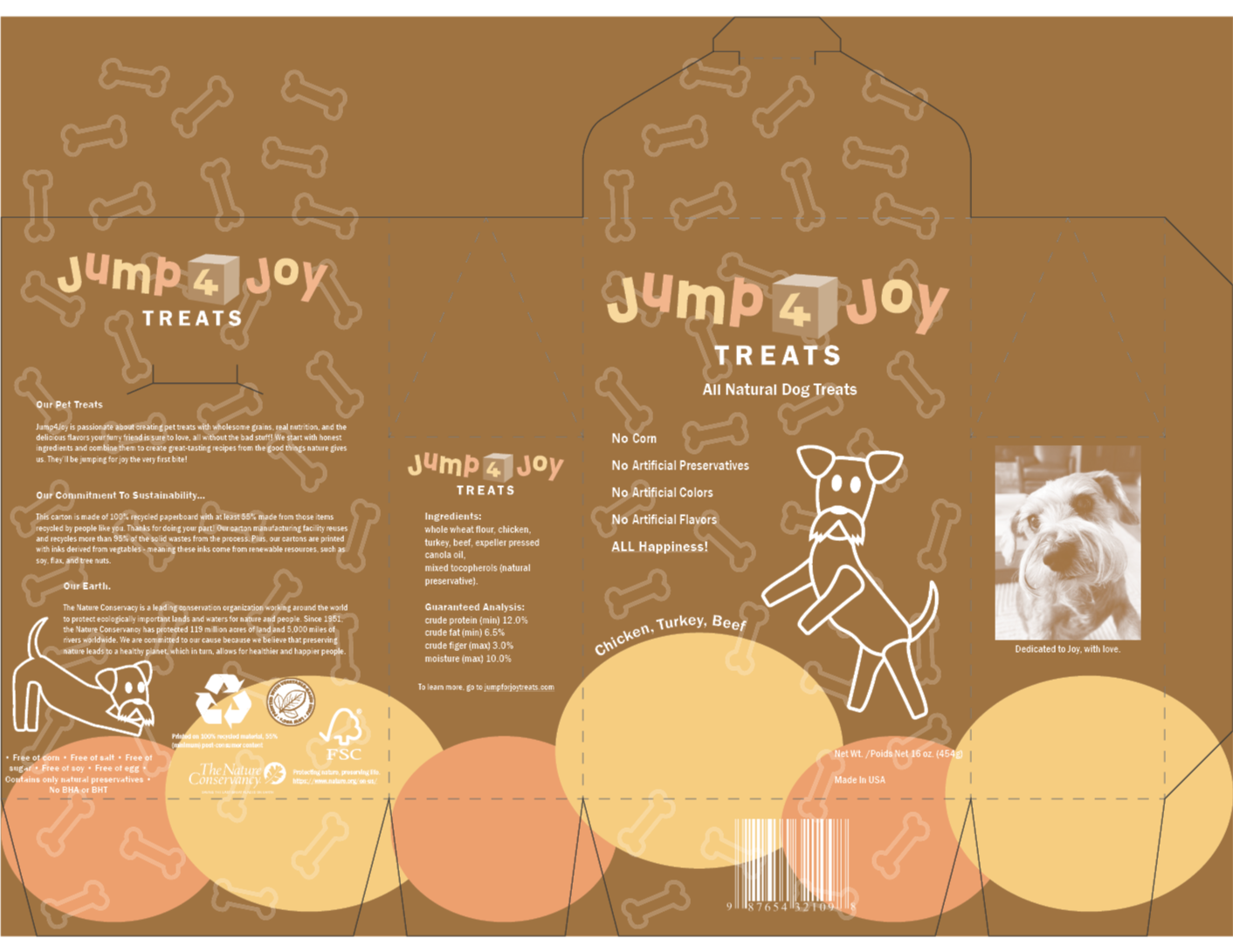
The complete dieline I used for the packaging, containing all the information needed to make it seem like a real product for dogs.
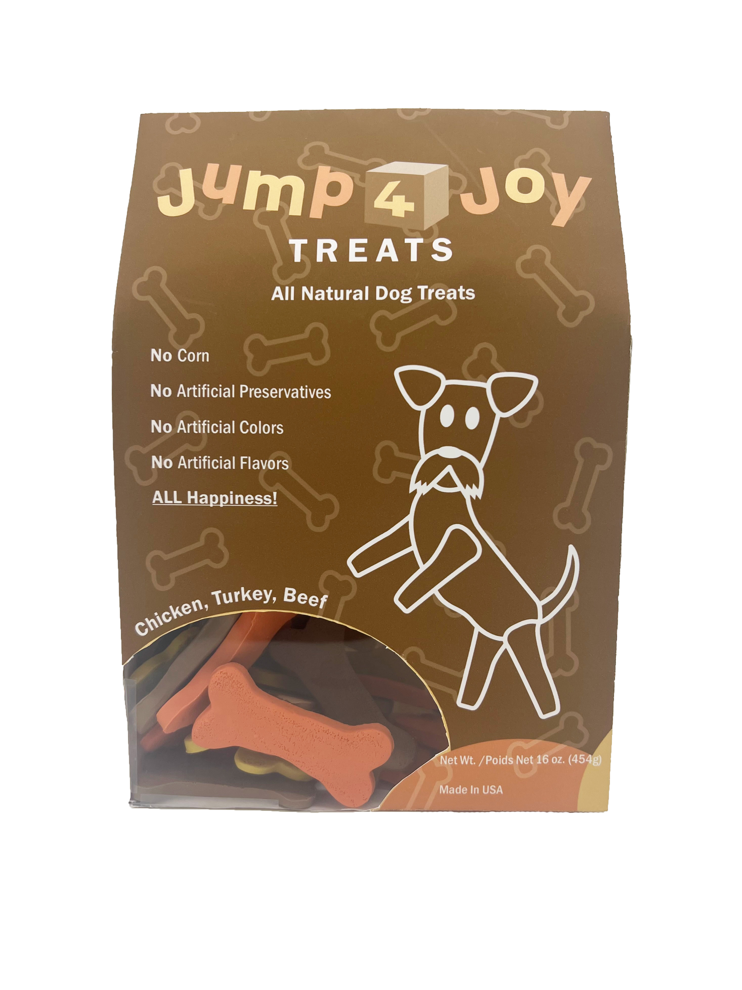
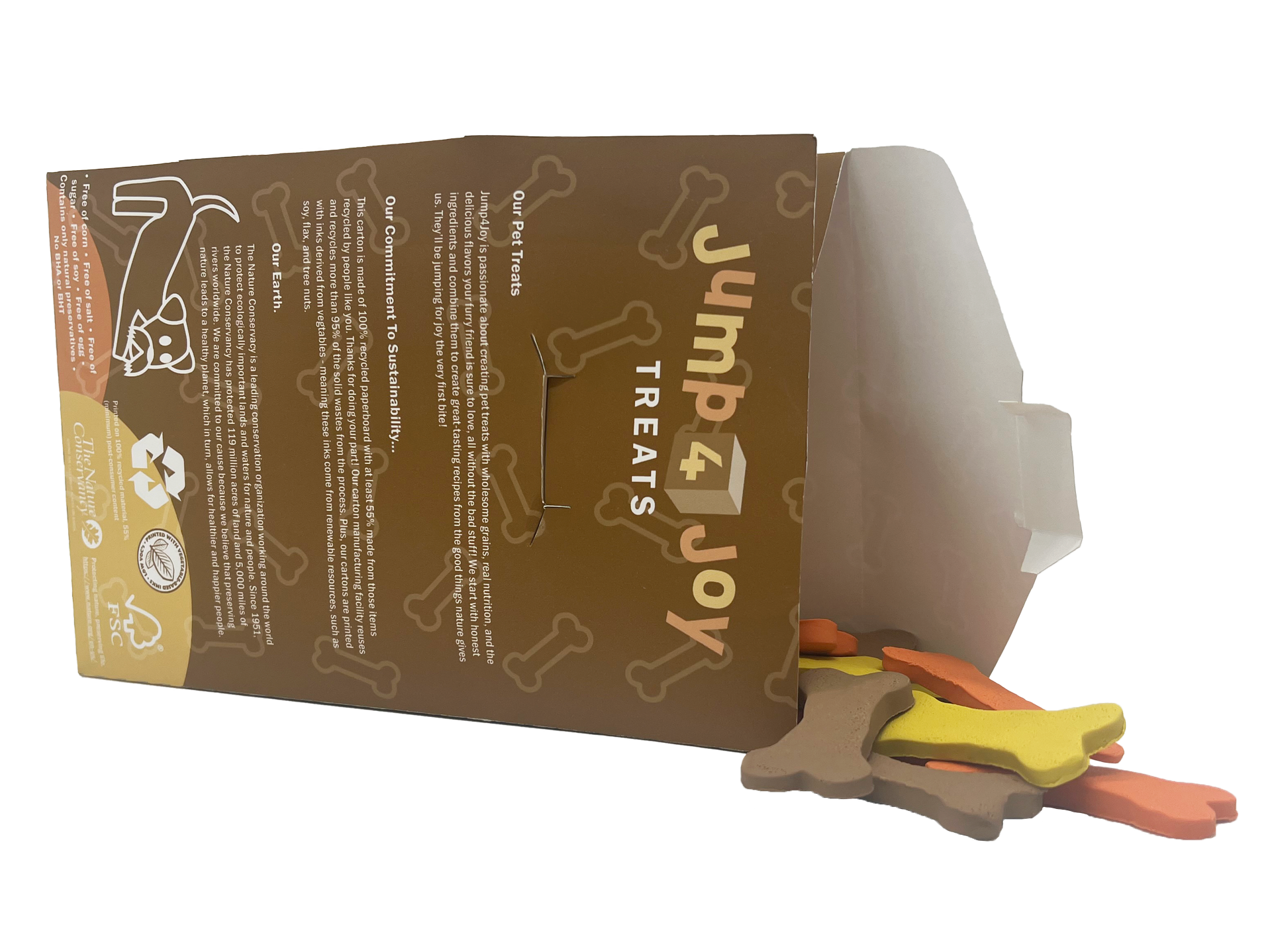
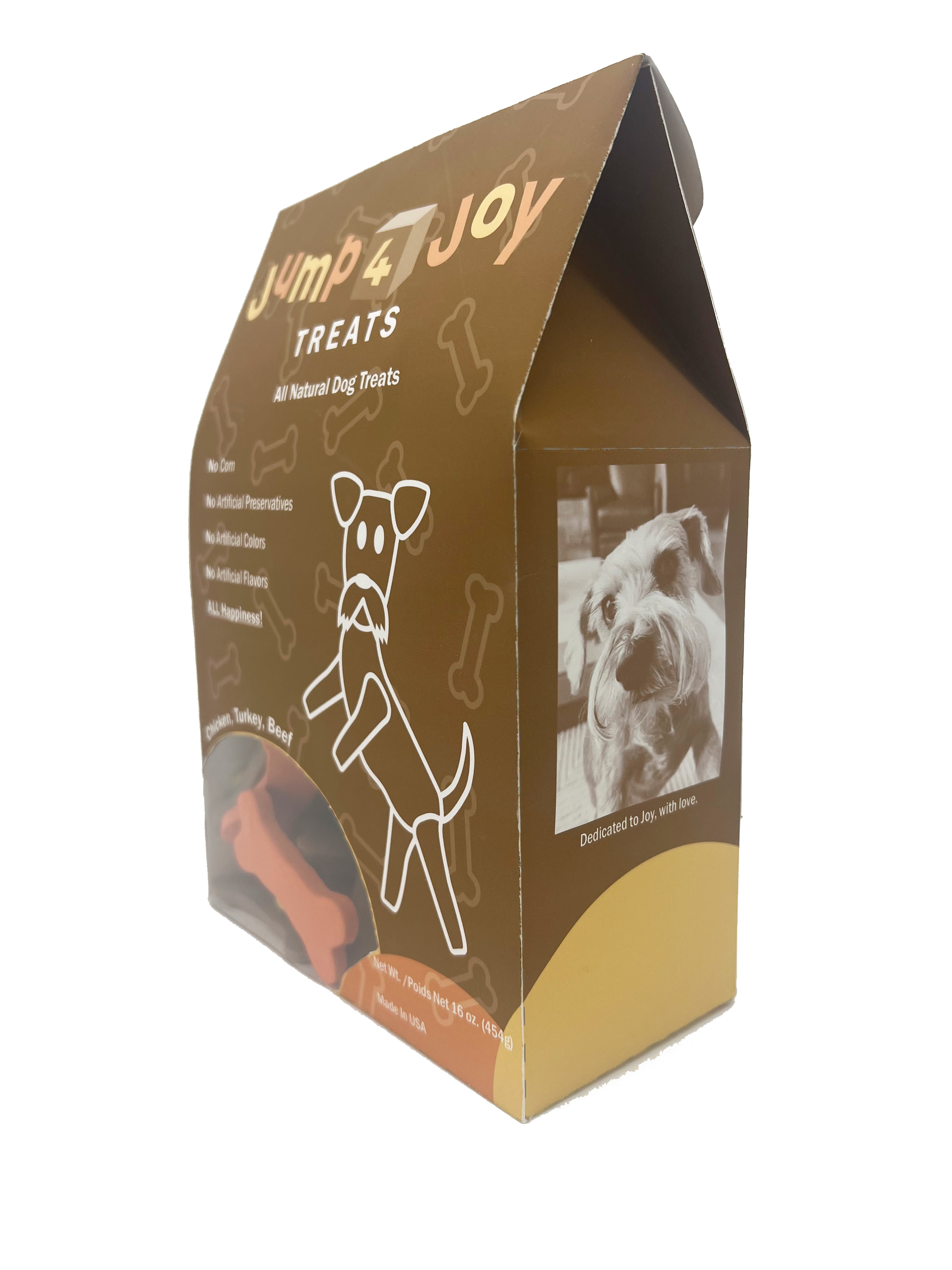
I took the likeness of dog treat packaging a step further by making my own pretend treats using polymer clay, and even giving each texture for accuracy. Safe to say it turned out exactly what I hoped for it to look like.